 Brand system
The plan →
Brand system
The plan →
Brand system
The plan →
Brand system
The plan →
The Summit Club · Indian · Nepali · South Wharf
Your logo, colours, type and voice, set down so every menu, post and sign feels like the same room. Built from what you already have.
One · The mark
The full lockup leads. Where space is tight, the emblem stands on its own, on cream, olive or terracotta.
 emblem · for avatars, stamps, faviconsemblem on olive-deep
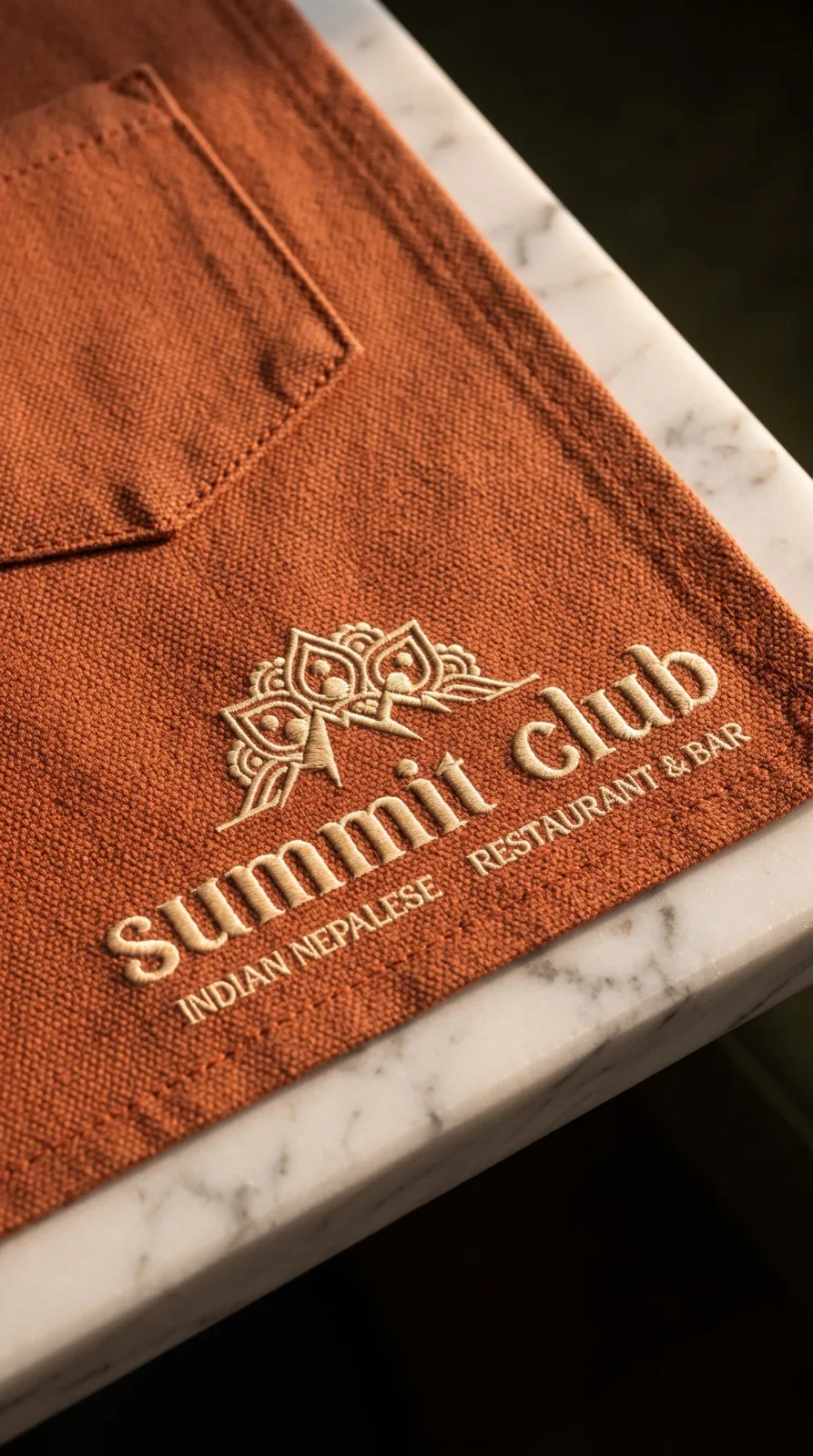
Keep clear space around the mark equal to the height of the mountains. The gold sits warm on cream, olive and terracotta; never stretch, recolour the fill, or add a shadow.
Two · Colour
Three colours carry everything. Olive grounds it, terracotta warms it, cream gives it room to breathe.
Three · Type
Himalayan food,
on South Wharf.
Headlines, menus, the name over the door.
Aa Bb Cc 0123456789 · light, regular, medium · italic throughout
Real momos, folded by hand.
A geometric sans for menus, captions and everything you read at length. Clean, friendly and modern, it lets the serif and the food carry the character. Set it in medium for body, semibold for labels.
Aa Bb Cc 0123456789 · set in Circular Std Medium
Four · Voice
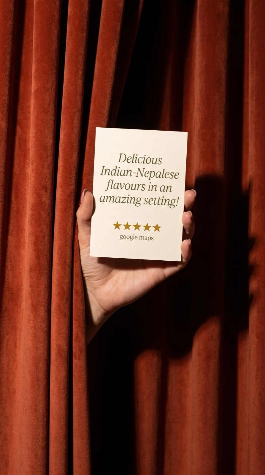
Warm, vibrant and authentic. Like the welcome at the door, not a menu read aloud.
Hospitality first. Speak like you'd greet a regular.
"We have a table for you."
Colour and appetite. Lead with the food and the room.
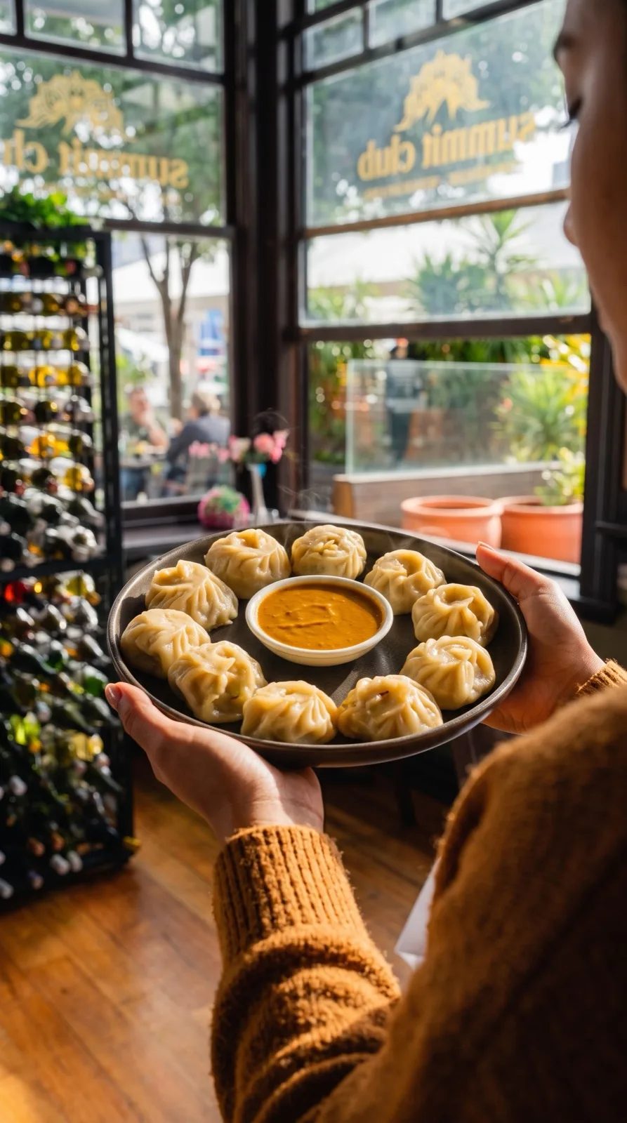
"Momos, folded by hand, eight to a plate."
Real Indian and Nepali. No hype, no cliches, no exclamation marks.
"Himalayan classics, done properly."
Five · Photography
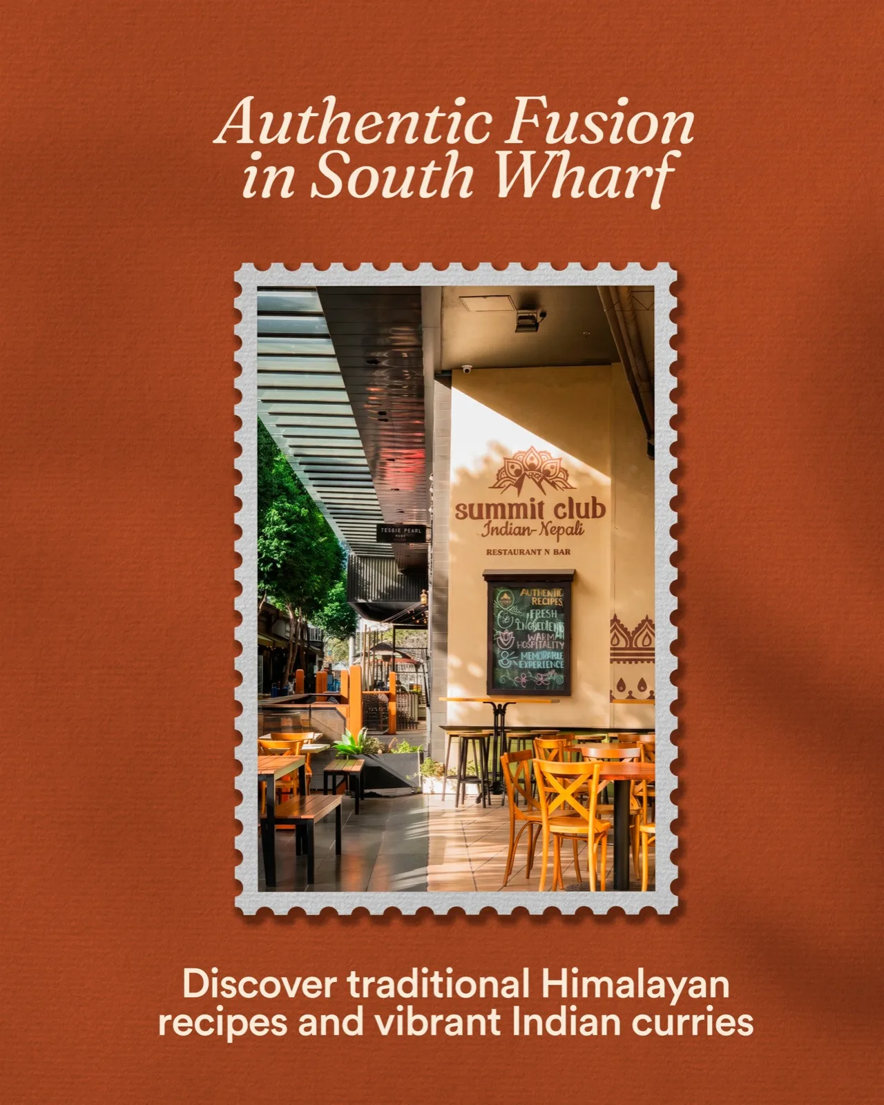
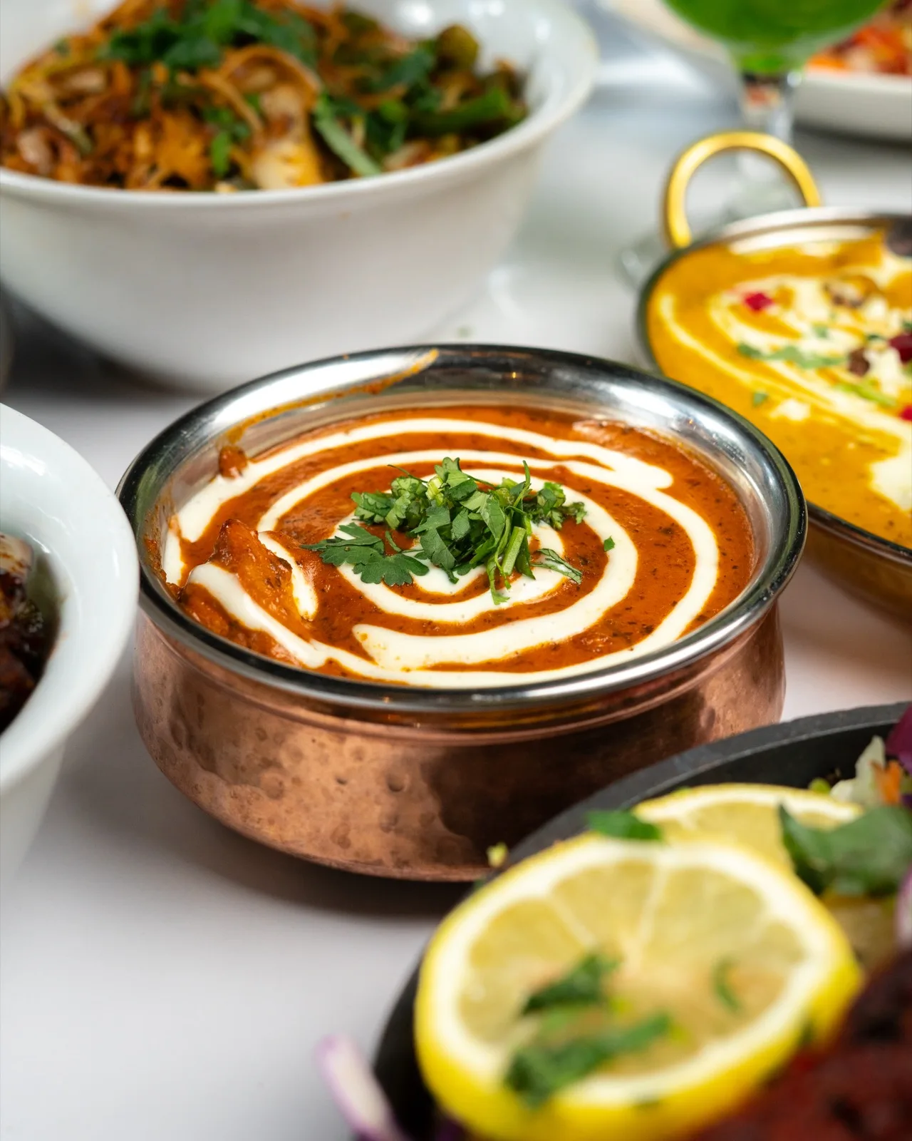
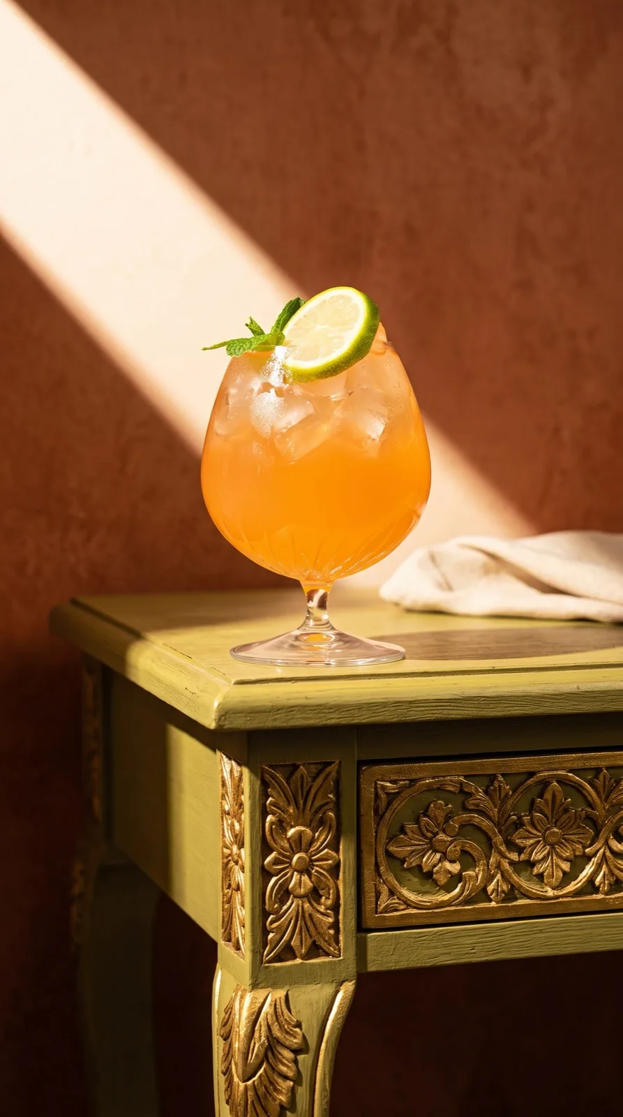
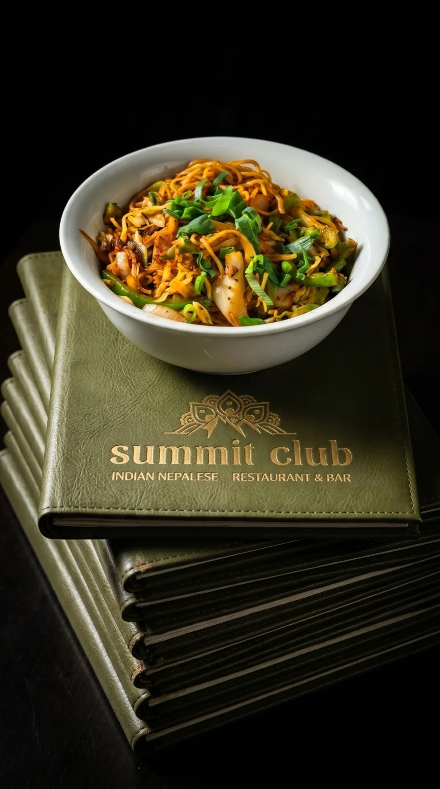
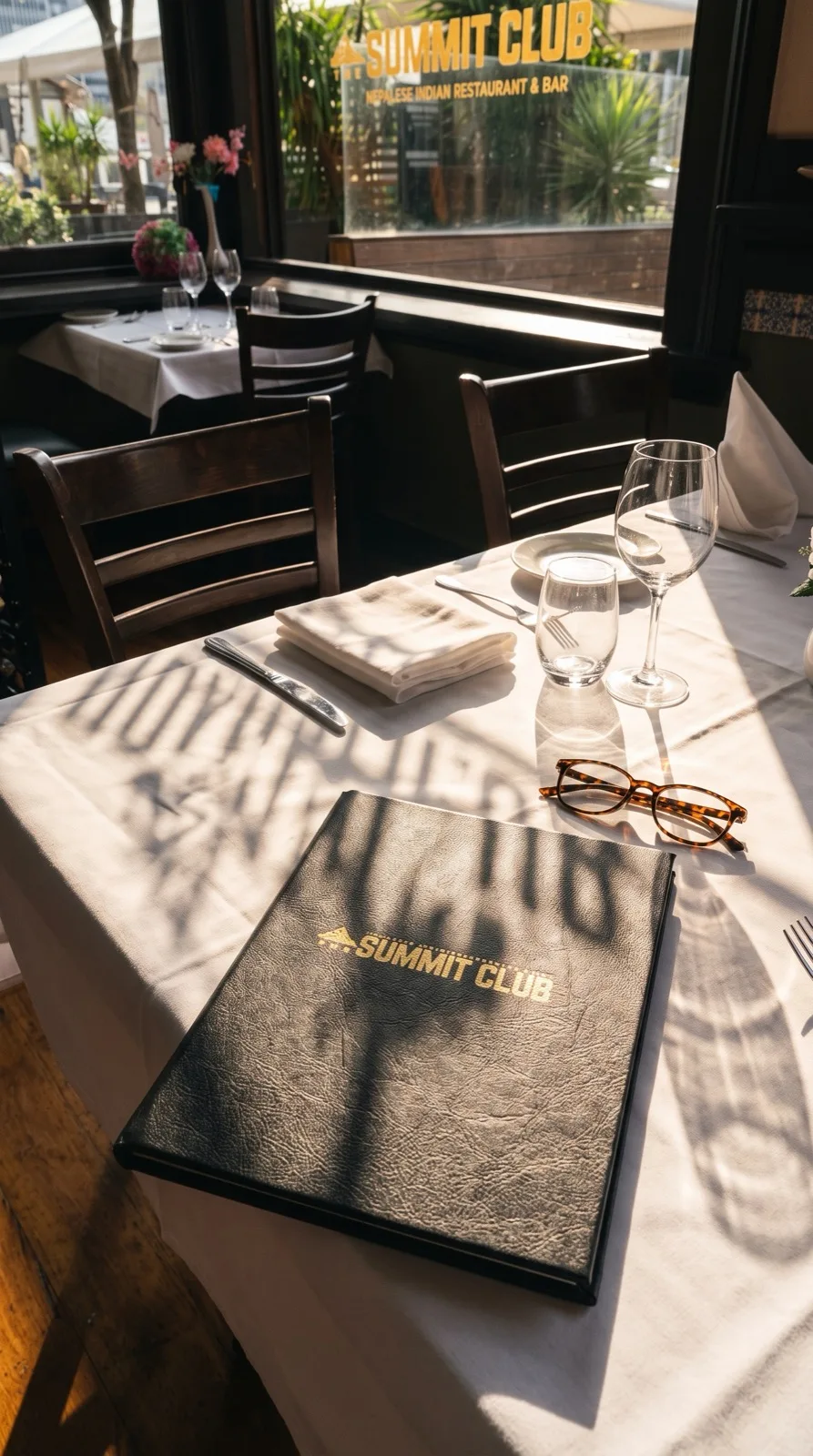
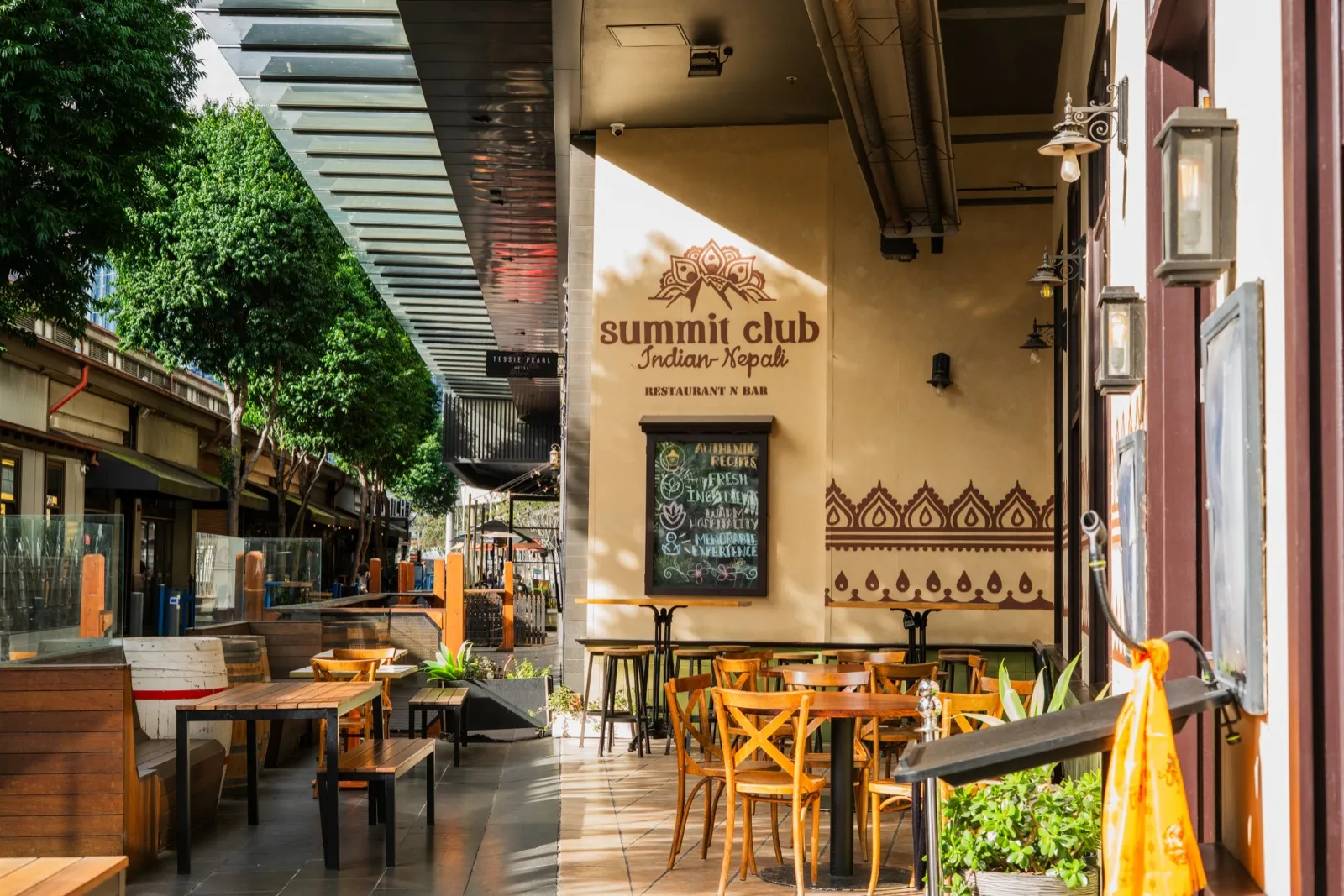
Natural light, close on the food, the gold and the promenade. Shot in the same warm key so every image belongs to the set.
Six · In use